
Walk into two different office spaces and you may immediately feel the difference. One feels calm, focused, and welcoming. The other feels distracting, sterile, or even tiring. While furniture and layout matter, one of the most overlooked factors influencing workplace productivity is something surprisingly simple: color.
Across offices and commercial spaces in Providence and throughout Rhode Island, property managers are beginning to rethink interior paint choices as part of workplace design strategy. The right color palette can influence focus, reduce visual fatigue, and even shape how clients perceive a business the moment they walk through the door.
For facility managers responsible for maintaining productive and professional environments, paint is not just cosmetic. It is part of the performance of the workplace itself.
Why Color Matters in Commercial Spaces
Employees spend a large portion of their day inside office environments. The colors surrounding them influence mood, energy levels, and attention.
Certain colors can help:
- Improve concentration
- Reduce mental fatigue
- Create a sense of calm
- Make workspaces feel more welcoming
This is why many modern office renovations now include strategic color planning, especially in coworking spaces and commercial buildings across areas like Warwick and Cranston.
When applied thoughtfully, interior paint becomes a subtle but powerful productivity tool.
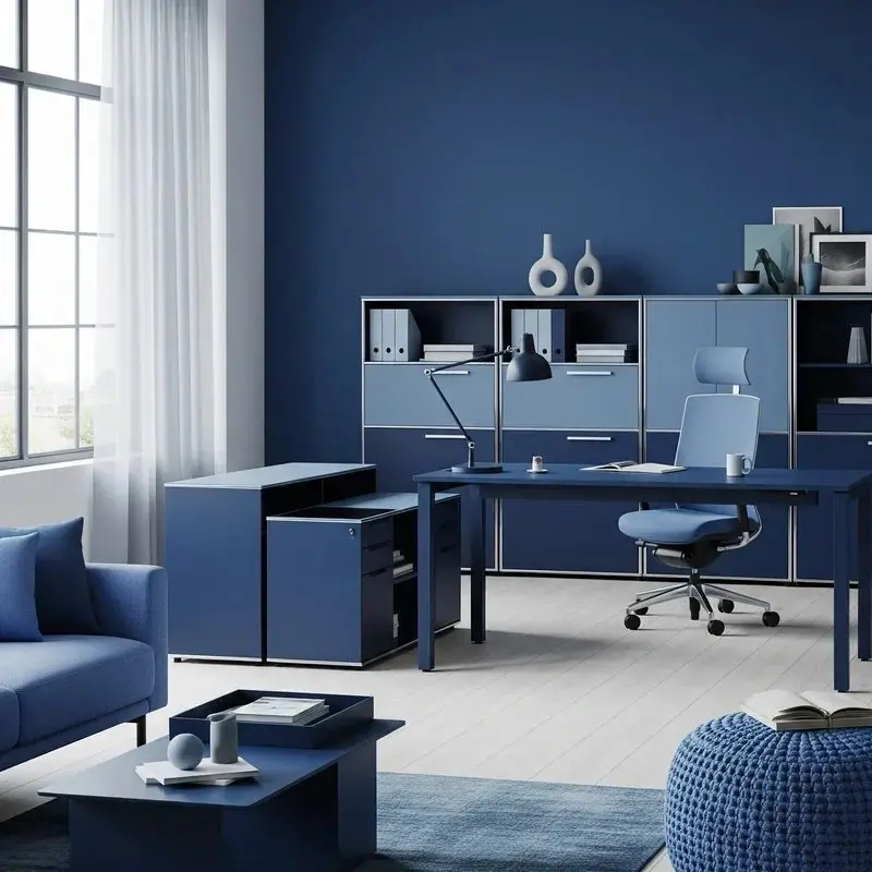
Blue-Greens for Focus and Clarity
One of the most effective color families for workplace productivity is blue-green. These tones combine the calming qualities of blue with the natural balance of green.
Blue-green shades are often used in:
- Open office areas
- Focus rooms
- Conference rooms
- Shared workspaces
These colors tend to reduce visual stress and encourage sustained concentration, making them particularly effective for environments where employees spend long periods working on complex tasks.
In professional offices across Providence’s downtown business district, blue-green tones are becoming a popular alternative to the stark grays that dominated office interiors for years.
Warm Whites for Welcoming Lobbies
While focus colors matter for workspaces, first impressions matter most in entry areas.
Reception areas and building lobbies should feel clean, bright, and inviting without feeling cold or sterile. This is where warm whites play an important role.
Warm whites help create:
- Bright but comfortable environments
- Professional first impressions for clients
- A sense of openness and calm
They also work well with natural materials often found in modern commercial interiors, such as wood desks, stone floors, and glass partitions.
For office parks and commercial buildings throughout Rhode Island, warm neutral palettes help balance professionalism with comfort.
Strategic Color Zoning
Many commercial spaces now use color zoning, where different areas of a building feature slightly different tones designed to support specific activities.
Examples include:
- Focus areas using calming tones
- Collaborative spaces with slightly warmer neutrals
- Client-facing spaces designed to feel bright and welcoming
This approach helps create environments where both employees and visitors feel comfortable navigating the space.
A Small Change With Big Impact
Interior paint may seem like a minor detail compared to lighting, furniture, or technology upgrades. However, color plays a major role in shaping the daily experience of a workplace.
For commercial property managers and facility teams, thoughtful color selection can support productivity, reinforce brand image, and create environments that employees actually enjoy working in.
As workplaces continue evolving, interior paint is becoming less about decoration and more about intentional design. Many businesses work with professional commercial painters in Rhode Island to create interior environments that support both productivity and brand presentation. Companies that invest in well-planned spaces often discover that even subtle changes can have a noticeable effect on how people feel and perform throughout the workday.
Businesses looking to improve their workspace environment often benefit from professional guidance when selecting interior paint colors and finishes. If your office or commercial space is ready for an update, you can contact Two Brothers Painting to discuss professional commercial painting solutions for your workspace.
Free Painting Estimate
Do not fill this form out if you’re a solicitor.